My alternative movie poster for Mad Max 2: the Road Warrior, which I'm slowly chipping away at.
Mel needs to look a little more Melish, but I'm making progress.
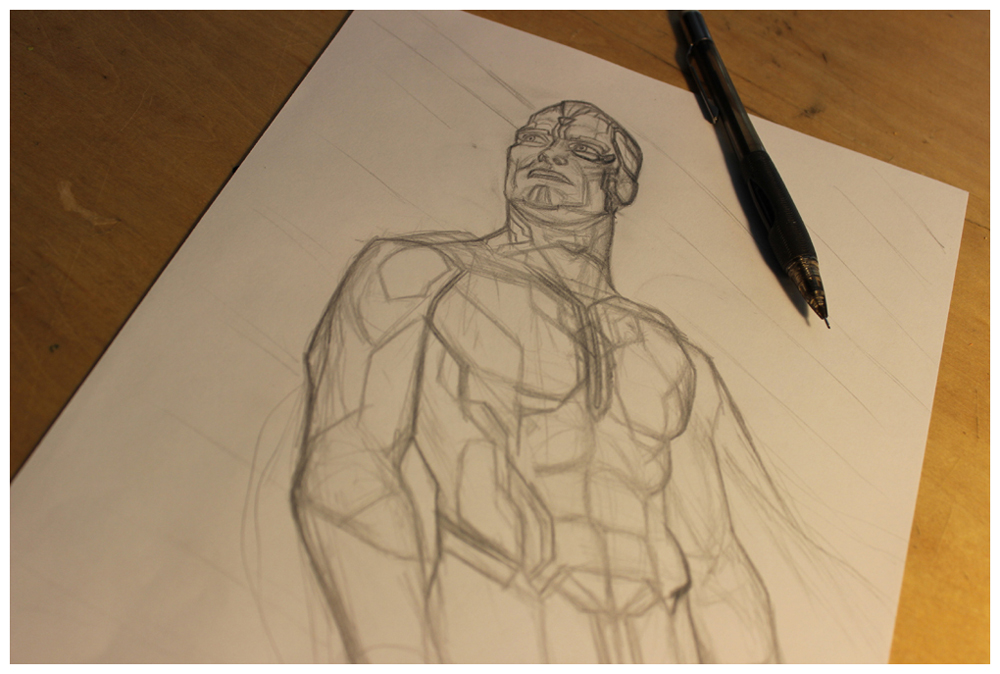
Here's where I'll be posting all my Blade Runner character sketches. I don't know how long it'll take me to do all 13, but I'm going to enjoy every minute of it.
Yup, that's it, just my sketch of The Dude. You're welcome.
Bruce Willis has one sweet mug, and the pencil drawing came easily without any re-sketching, which was a pleasant change from my usual mad scribbling.
This was also my first time drawing/painting directly on the screen with a stylus, and I instantly loved it.
The distressed Die Hard lettering was made by painting wooden strips with India ink and stamping them onto paper (first used to make Hannibal's plaid/tartan suit pattern), then scanning the result. The sign smudges were similarly made with ink and an old studio rag.
At first I went super-geometric with this one, matching the incline of his head to the angle of the sign, but at the last minute I dialed it back somewhat, though it's still not an accurate representation of Willis' skull shape.
This was my first experiment in drawing a face twice - once as a realistic portrait, then again with stylized shading, and combining the two in Photoshop.
I never work from a single photo when drawing a celebrity portrait. I feel like that would be stealing from the photographer who took the picture. Also, I can rarely find the exact lighting, facial expression, and angle I want in a single photo, so I combine elements from a group - and then make up the rest.
Case in point, Mads Mikkelsen as Hannibal Lecter.
If necessary, I'll also use some reference photos of myself, as I did here holding the dish.
The Hannibal steak was drawn by closely watching the Visible Human Project's videos of thinly sliced cadavers.
With all of the pencil work finished (except for the sprig of parsley, which I did last), I moved on to the plaid/tartan suit pattern and shape, all of which was done in ink using a brush, a Pilot Parallel pen, and wooden strips to make various marks on paper.
Then everything was assembled and colored in Photoshop.
I received several comments online about this resembling a "South Park Canadian" which I had to look up because I don't watch South Park. There would have been a fascinating synchronicity to this if Hannibal were Canadian, but he isn't and neither are any of the actors who've played him.
My idea for this was simply Will.I.Am in a spacesuit with a wedge cut out of the helmet to match his hair. Beyond that I made it up as I went.
Near the end I redrew the glove to resemble some kind of high-tech gecko paw.
Other than that it was smooth sailing.
If you have a better title suggestion than "sword arm" I'd like to hear it!
Beyond the sketch and line art you see here, the bulk of this one was painted in Photoshop.
Initially the most important part of this poster for me was making a convincingly crappy 80s VHS label.
I also scanned an actual American Psycho VHS tape for texture, and digitally colorized it to create a kind of Warholian screen-print effect that I think works nicely.
Once I'd done that I moved on to drawing Christian Bale as Patrick Bateman.
I bought an ax from the local hardware store and took some photos of me posing with it. This is the kind of thing that willingly gets me out of my studio or away from my drawing table every once in awhile.
I drew the raincoat separately so that it could be layered, semi-opaquely, on top of the pin-striped suit.
The screaming Christie (actress Cara Seymour) was drawn from some screen captures of the film. The poses of Patrick with the chainsaw and the dead hooker were mostly made up.
I am only interested in doing movie posters for which I have a clear visual idea, one that does not repeat the original marketing campaign for the movie, but shows something new. In this case it's that Patrick Bateman is hiding behind a mask of pop culture detachment. He's not a real person at all, and is only capable of interacting with the world through the lens of 1980s movies and brand identity.
Half the time spent drawing this one was getting the head/helmet right. I referred to some photos of old art deco style radios and other appliances from that era, but ultimately I had to make it up, while matching the original Robocop's faceplate design.
It turned out I could have drawn it much smaller, and quicker, if I'd stuck with my 0.5mm mechanical pencil (instead of Black and Cool Grey Prismacolor Verithins), but I like to experiment. And experiments are where I very often learn what not to do.
My daughter Julia likes to hang out with me in my studio, because I have all the cool art supplies. It's quite possible she draws more than I do. She's certainly faster.
Other activities include Hexbug races and marathon Candyland sessions.
I plan to turn this into a finished illustration someday soon, but for now this is all I have.